Light Speed —
Queenstown, New Zealand
Branding, Illustration
About
LightSpeed Technology Group has been operating in the Wakatipu basin since 1993. Their services range from residential, business planning and optimisation of any network design to installation, maintenance and advice. They offer the fastest high-speed wireless broadband service available in the Wakatipu. They are ‘The Wakatipu Broadband’.
We worked with the concept “always be connected”. Since their services don’t require cables they can provide broadband where others can’t, so we want to put the focus on that aspect of the company. As a local business they know the field like nobody else and have the experience of solving and customising their services with a personal and 24/7 approach.
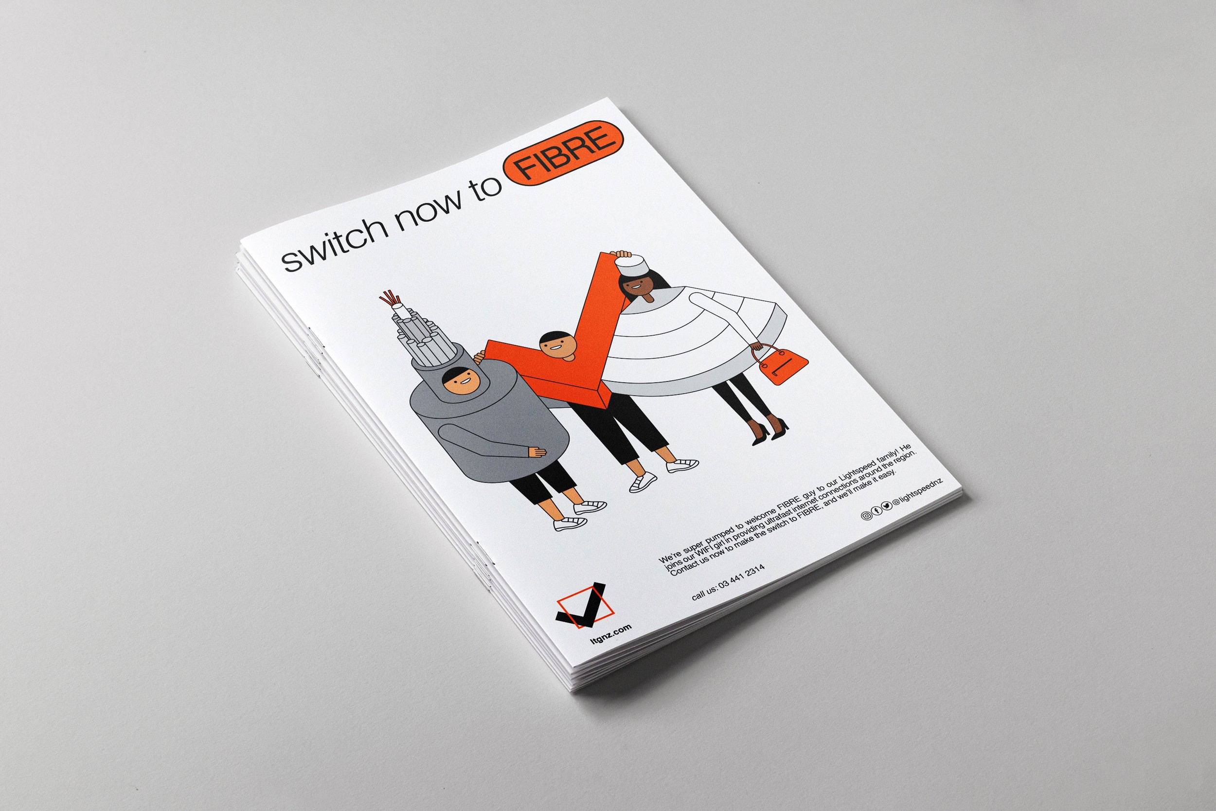
The design concept was represented with a word-mark as a 'check mark'. This tick or check mark indicates yes/verified. It is a universally recognised symbol with a positive connotation. We decided to move forward in this direction to avoid being literal with the usage of ‘speed' that is already represented by both the name and the service. We achieved an identity that reflects the positive values of the service in every aspect; from the quality of the broadband service to the personalised human treatment. Everything is double 'checked' for the customers so they can be connected at all times.
A fundamental aspect of the design was to develop an identity that does not look like a corporate and impersonal company but rather local and professional. The outcome was a truly empathic approach to clients of any age creating a genuine connection and emotion with the whole branding.
www.light-speed.co.nz


Words by Dave Parker—Director
“Working with MAKEBARDO was a great decision, their skill level and impressive creativity inspire confidence, and working with them was a pleasure. Luis and Bren were very receptive to our input regarding the direction / look that we desired, and most importantly the end product was a big success.”