For Another Self— Natural & Organic Tattoo Aftercare
-
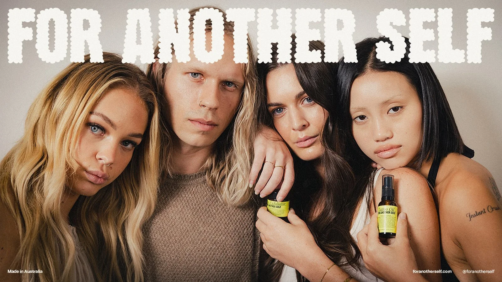
For Another Self, develop a tattoo aftercare line that goes beyond the basics. Their 100% organic, small-batch formulas are crafted like skincare—lightweight, non-greasy, and designed to hydrate, protect, and enhance the vibrancy of your art. Recognising that tattoos are an essential form of self-expression and identity.
The concept behind the “For Another Self” brand encapsulates the idea that we are unified identities made up of diverse inner selves. Much like tattoos that transform skin, our expressions and experiences evolve, yet our essence remains constant. The brand celebrates this fluidity, encouraging us to embrace all facets of our personalities and journeys. The tagline, “Natural & Organic Tattoo Aftercare,” clearly conveys the product’s purpose.
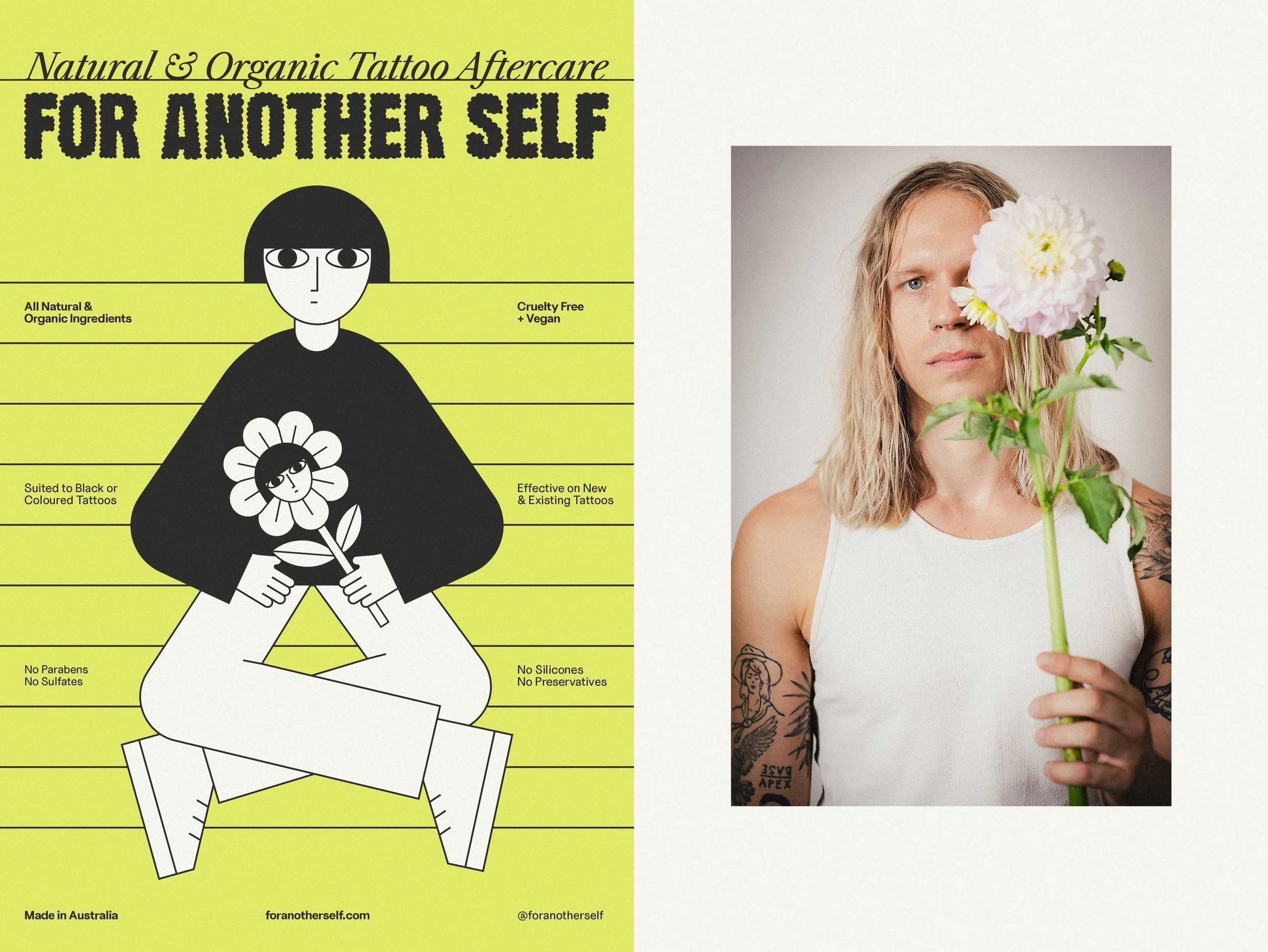
The brand utilises a scrapbook metaphor, where the body serves as a narrative space: untattooed skin is a blank canvas, while tattooed skin becomes a journal of memories. The bespoke wordmark, inspired by hand-drawn scrapbook lettering and featuring unique “cloud” glyphs, reinforces a “dreamer” attitude and a laid-back approach to self-expression.
The brand name captures the core belief that individuals experience a range of emotions and states—from powerful to vulnerable—without losing their essential identity, encapsulated in the phrase “I am what I am.” This concept is visually represented by a gender-neutral character with a deliberately neutral expression, challenging the expectation of constant positivity. There’s no need for pretence—just authenticity. Simple, colourless line drawings promote inclusivity and reinforce a carefree brand attitude.
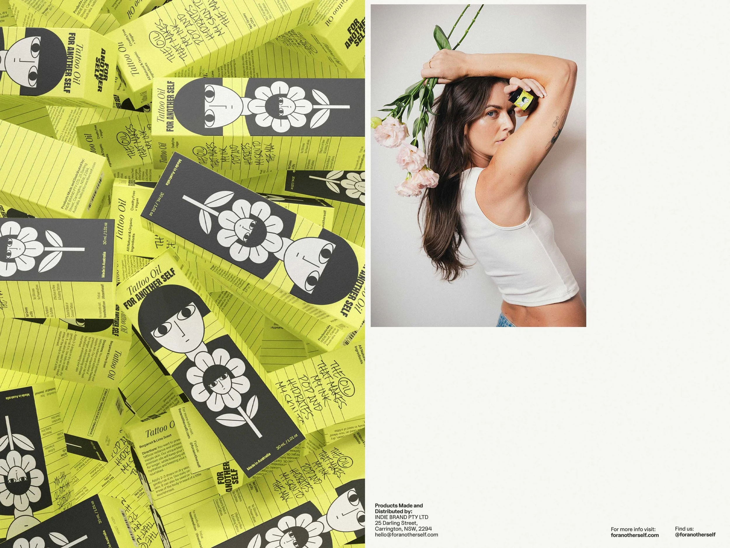
Each product showcases a distinct element that embodies its attribute: the fragrant oil is represented by a flower; a cat with its gentle scratches represents the exfoliating scrub; and the tattoo-recovering balm is depicted as a self-mask, symbolising a fresh “new face.” These subtle, humorous touches reinforce the brand’s playful and creative nature. It helps us connect on a deeper level, showing that we don’t take ourselves too seriously, but we are serious about quality and care.
To maximise brand recognition and visual consistency, we decided to go with a vibrant lime-green colour complemented by the subtle use of an off-white and off-black. The product type is prominently displayed at the top of both container and box designs for easy identification on shelves, eliminating the need for product-specific colour-coding.
CREDITS
Photography:
Henry Brodbeck from @newydigital
Kate Olivia from @kateoliviaphoto
PUBLICATIONS
Rolling Stone, AU/NZ